About Time!
The knowledge about mortgages should be accessible for all young couples. Not exclusively for the banks.
The Challenge
How might we make the mortgage industry, which we instantly think of as “boring” & “grey” – interesting, young, and attractive? How might we design a website that is different from the old, usual banks’ websites?
The main purpose of the website is to make information accessible, we were requested to create an easy educational experience, that will change all the bad memories we have about finance.

Luckily, we love challenges
As always, we fulfilled the unique requirements and designed a winning experience.
Who said learning has to be boring?
We were required to build Eyal’s knowledge base – a library of articles organized as units, step by step to the selection of the best mortgage you can get.
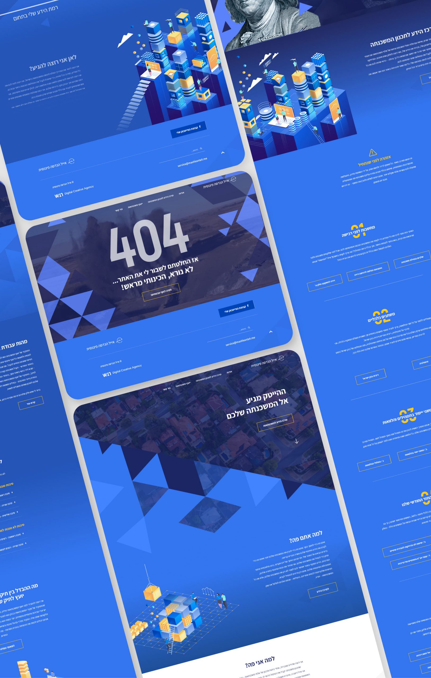
We focused on making everything organized as possible, with simple navigation between units and at the same time keeping the learning experience nice and who knows – maybe even fun!
We focused on making everything organized as possible, with simple navigation between units and at the same time keeping the learning experience nice and who knows – maybe even fun!
Simple Isometric Illustrations
We needed a strategy to prevent the frustration most of us have when we dig into the world of finance.
We created a lot of friendly illustrations that will make the learning more pleasant and the content more visual.
We used blue colors – a color selection that reflects security, we think searching for a mortgage is searching for security – not stress.
We created a lot of friendly illustrations that will make the learning more pleasant and the content more visual.
We used blue colors – a color selection that reflects security, we think searching for a mortgage is searching for security – not stress.


Making complex data look easy
We all hate those boring, messy financial graphs – it seems impossible to understand them, but the secret is in design.
Our team designed clean graphs with filtering options that are easy to use, so you can find the information that is more important for you.
This is a breaking point for all the young couples out there – no more trying to read unreadable graphs!
Our team designed clean graphs with filtering options that are easy to use, so you can find the information that is more important for you.
This is a breaking point for all the young couples out there – no more trying to read unreadable graphs!
The team was flexible, super creative and had 24/7 service. They lead the creative process from end to end and delivered an outstanding outcome.
Eyal Rittberg
mashkanta4.me


